Samsung, one of the world’s most iconic technology brands, has evolved not only in its products but also in its visual identity. The Samsung logo, simple yet powerful, embodies the company’s journey of innovation and strategic vision.
The Evolution of Samsung’s Logo
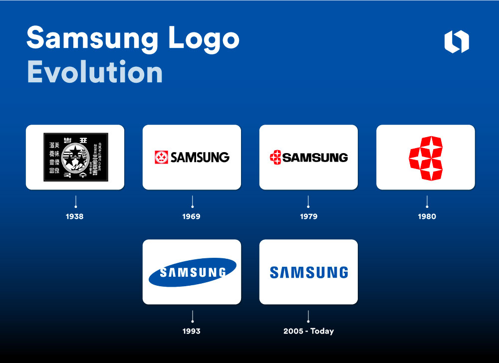
The first Samsung logo appeared in 1938 when the company was primarily focused on agricultural and food products. The logo featured three stars, aligning with the meaning of the name “Samsung” in Korean, which translates to “three stars.” This symbolized greatness, prosperity, and longevity. Over time, the logo underwent several changes to reflect the company’s shifting vision and mission.
In 1993, Samsung introduced the modern logo: the word “Samsung” in white, set within a blue elliptical shape. The ellipse represents the universe and globalization, underscoring Samsung’s commitment to expanding its global presence. The blue color was chosen to convey trust, professionalism, and the reliability of its high-tech products.

The Meaning Behind the Current Design
Samsung’s current logo is minimalist, designed to evoke a sense of modernity and easy recognition. The “Samsung” lettering is clean and straightforward, free from any complex lines or unnecessary details, symbolizing the company’s focus on clarity and efficiency—values that mirror Samsung’s approach to technology: sleek, effective, and forward-thinking.
The consistency of the logo over the years highlights the importance of maintaining a cohesive brand identity. Despite major innovations in technology and product offerings, Samsung has stayed true to its brand, using a simple yet meaningful logo to represent its global influence.
2005 – Today: A sleek lettermark logo

The design team discarded the oval being and opted for a sleeker, more modern lettermark logo. They carefully designed the spacing based on how the human eye perceives visual cues to improve the logo’s visibility, reflecting the company’s dedication to quality, progress, and user experience.
Lessons from the Samsung Logo
The evolution of Samsung’s logo is a testament to how a major brand must not only innovate its products but also grow in how it visually represents itself. The logo’s transformation reflects the company’s developmental milestones and illustrates how Samsung has continuously positioned itself on the global technology stage.
